
Testing makes all the difference…
…and here is why. Having your website work perfectly on every browser and device could make or break your success. Here at htmlBoutique, we absolutely understand that. This is why we give our best into making your project boutique. Your success is the measurement of our success.
It is not simply desirable to make your website compatible with the majority of devices and browsers. It is imperative. Here is a list of our must-test browsers: Chrome, FireFox, Safari, IE11+, Mobile Safari, Mobile Chrome and Android Browser. Needless to say, we are not fans of dated technology. However, since your happiness comes first, we could test your project on a bit older versions upon request.

During the development phase, we prefer working with Chrome. Since we have always abided by delivering a boutique-class code, we write the HTML, CSS and JavaScript in compliance with the world’s best practices. But this factor alone is not enough to ensure a boutique end result.
Once the templates are completed, we pull out the ultimate weapons from our boutique arsenal: strict final testing and quality assurance.
We rarely use simulators. We prefer the real deal. Here is a list of the browsers we support:
- Internet Explorer 11+ (Windows)
- Microsoft Edge (Windows)
- Firefox latest (Windows)
- Google Chrome latest (Windows)
- Opera latest (Windows)
- Safari latest (Mac)
- Safari iPhone (iOS 8)
- Safari iPad (iOS 8)
- Default Browser (Android 5)
- Google Chrome (Android 5)
Usually, the initial testing is conducted by the developer in charge of the project. During this phase, they check out the whole project for issues and fix them. Most of the time, these issues turn out to be some very small browser-specific bugs.
The final exam your project needs to pass in order to classify as boutique, is the QA process. This is the stage when Della steps in. Once again, she tests the completed pages on all browsers listed above, as well as on a variety of the most popular devices until she is absolutely sure everything works flawlessly.
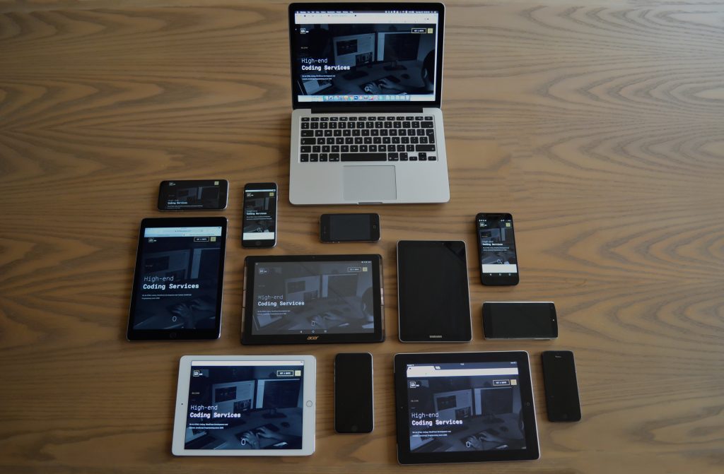
When it comes to the responsive versions, we test on real devices without exception.
Here’s the collection of devices that we use:
- a few iPhone 6 and 6s
- iPhone 5
- iPhone 4s
- 3 different iPads
- MacBook Air
- Mac Mini
- Nexus 5X
- Acer Tablet
- Samsung Tablet
- and a few more Android and Apple devices
Unarguably, testing all pages on each and every of these devices is as essential as optimizing our time management in order to deliver your boutique projects faster. That is why we have developed our very own application which loads a given URL address on all devices at once. This allows us to easily test the same page on multiple devices while avoiding the tedious process of loading every single page on every single device. Awesome, right?
When we say we would deliver high-end results, we… deliver high-end results. Testing is what lets us put the finishing touches of your project and make it boutique indeed. Unless your website works perfectly across all modern devices and browsers, our work could not be possibly finished. This is our way to ensure that you will always receive a boutique-class project in the end.