Step 1
Management
The ticket was posted in our client area, the so-called “Workshop”. After we carefully reviewed all details and clarified the requirements with our client, we were ready to move forward!
WordPress integration of a two-page site including a drag & drop custom page builder, parallax effects, animations.
The design was provided as well-structured Adobe Illustrator files. There were 3 files ( desktop, tablet and mobile ) for each page.
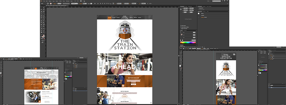
The main requirements were for a responsive and full retina-quality WordPress site with parallax effects. The client also needed customizable page sections which could be easily removed or added to any particular website page.
The requirements were clear - the project had to be responsive and with full retina-quality. Each section should be reusable from all pages and easily manageable from the WordPress administration panel.
Our client also had some additional needs:
Despite the well-structured and clear instructions, there were some things that our client hadn’t mentioned. We also discussed the following:
After clearing all details about the project, we made a summary that showed everything we would be doing:
The time frame for the project was 10 Business Days
The ticket was posted in our client area, the so-called “Workshop”. After we carefully reviewed all details and clarified the requirements with our client, we were ready to move forward!
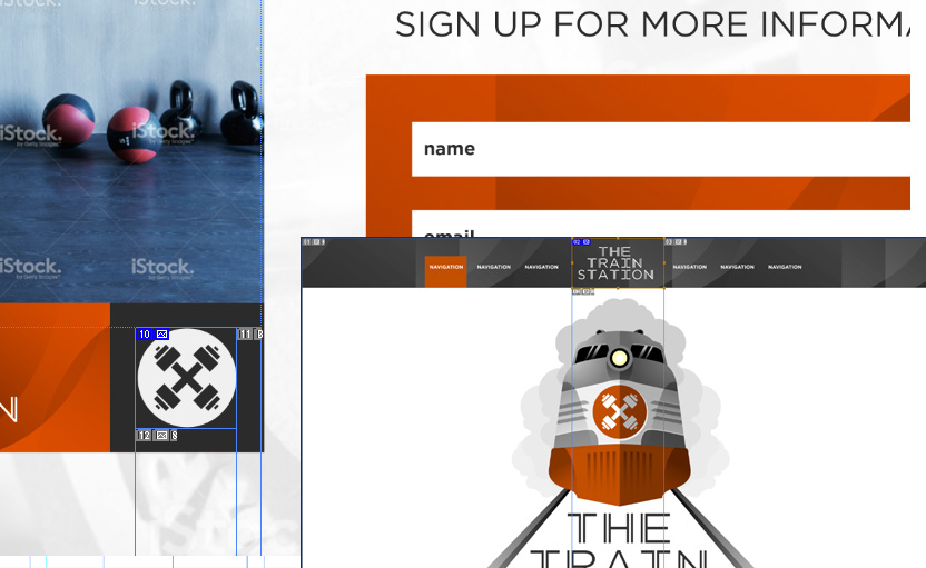
We sliced the images and exported them as @1x and @2x for non-retina and retina displays respectively.
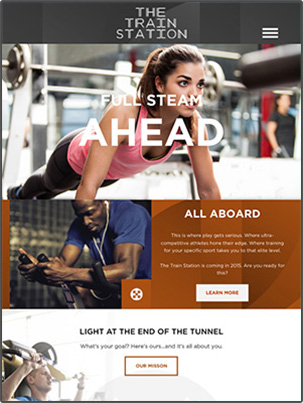
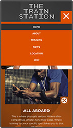
The provided designs were self-explanatory. We created the tablet and mobile layouts and applied a nice animation for the navigation menu.
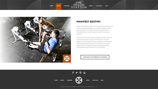
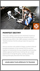
Most of the sections were pretty standard and we just stacked them for the mobile view. We also tested all buttons and made sure that they were easily clickable.
We created a complex parallax effect for the intro section which imitated a moving train, as well as a subtle animation for the secondary image area.
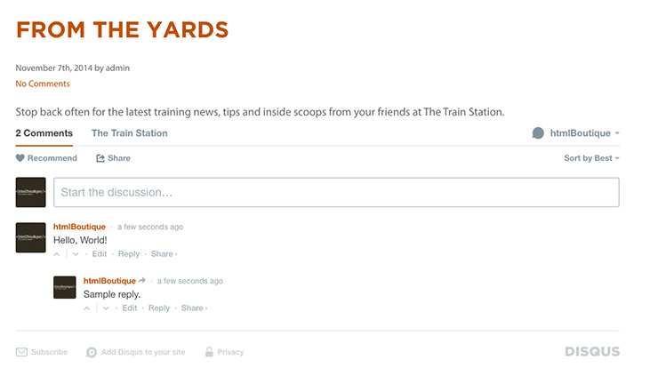
We created the blog at our discretion and best judgement. Additionally, our client requested the Disqus plugin which we installed and set.
Once the development was completed, Ted (front-end developer) tested the project on a few different devices and browsers. There were a few small issues which he fixed. After that, the project was marked as “Ready for QA”.
Then, Della (QA) started the quality assurance process. She reviewed the designs and the summary of the project. She tested the web pages on a majority of devices and browsers and spotted a few bugs.
Overall, she was happy with the result but there were a few issues that had to be fixed. She noticed a few more things that had to be polished in order to make the project perfect. Ted fixed the issues and finished the improvements.
After being done with the final touches, the project was reviewed by Scott. The WordPress integration phase was about to start.
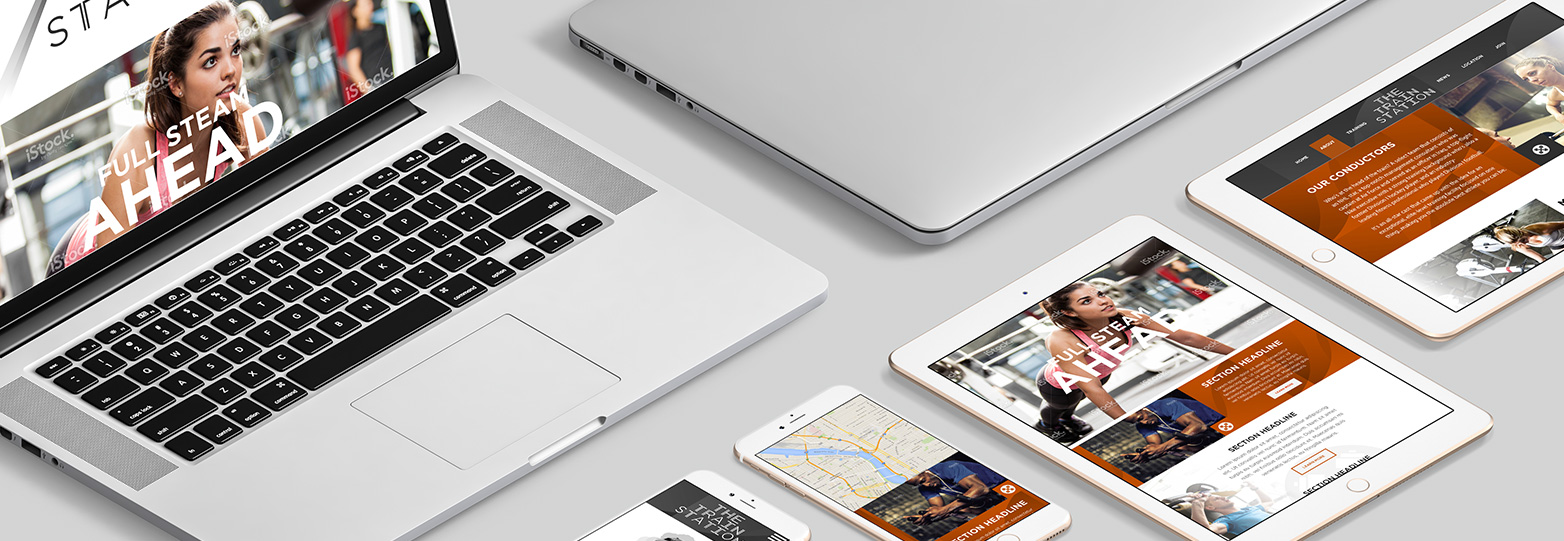
Let’s make the site fully dynamic
Stan ( back-end developer ) took the completed HTML files and created the skeleton of the WordPress site. The real show was about to start.
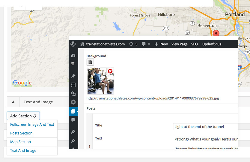
Our client needed a way to check off a section for each page and wanted to be able to create new sections on the inside pages.
We created 4 types of sections:
- Fullscreen Images And Text
- Posts Section
- Map Section
- Text And Image
Each section was made containing various fields:
- Google Map Field
- Image Upload Field
- Repeatable Button Field
Check out the video below the see the whole thing in action
We created an archive with the source files and uploaded the project to our preview server. Our client received a responsive, multilingual and easily editable WordPress site.
WordPress integration of a 6-page site including an e-commerce store, advanced product filtering, responsive layouts, and retina support.
WordPress integration of a one-page multilingual site including responsive work, retina support, custom animations, and parallax effects.
