

Here you are, standing in front of your beautiful landing page, admiring it. You can almost hear yourself humming “It’s raining clicks” …only to soon figure out, they are not. Oops, what went wrong? Turns out, the secrets of a successful and highly converting landing page lay within its name itself. So, the question is:
If LANDING PAGE was an abbreviation, what would each letter stand for?
Length of the page
The first thing to consider when designing a landing page is its length. There are a bunch of great successful examples for both long and short landing pages throughout the web which generate many leads and have a high conversion rate.
So how to decide which way to go for your own landing page? The rule to follow is:
- Go for a short, non-scrolling landing page if your product or offer is simple and predisposes the visitor to take a quick, even intuitive, action.
- Go for a long landing page if the product or service you offer are more complicated and would require some consideration time. In this case, you will raise your conversion rate if you motivate your visitors with additional information about your product or service’s benefits.
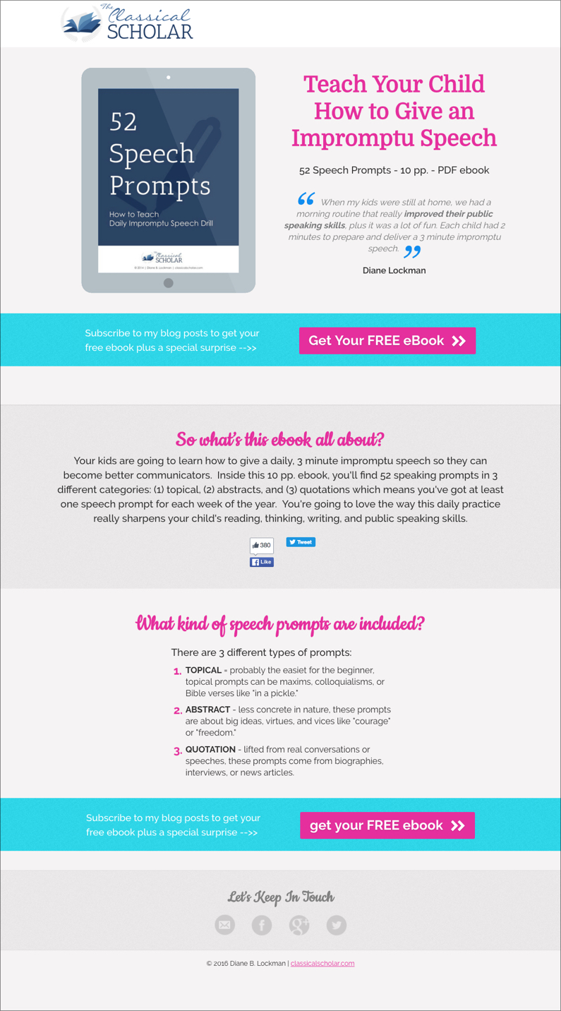
You can tell that The Classical Scholar put a lot of thought into designing their long landing page. They beautifully arranged their content above the fold and considerately provided enough additional information about their product’s benefits below. By repeating their CTA button, they unobtrusively prompted their visitors to convert and thus, improved their campaign performance.
Quick BouTIP
Always repeat your CTA at the bottom of your long landing page. If you force your visitors to scroll up in order to click your precious CTA and convert, chances are – they’d rather bounce back.
Attention grabbing headline
The perfectly written headline would:
- immediately nail your visitor’s attention,
- engage them with the content,
- increase their interest,
- and ultimately make them click the CTA button.
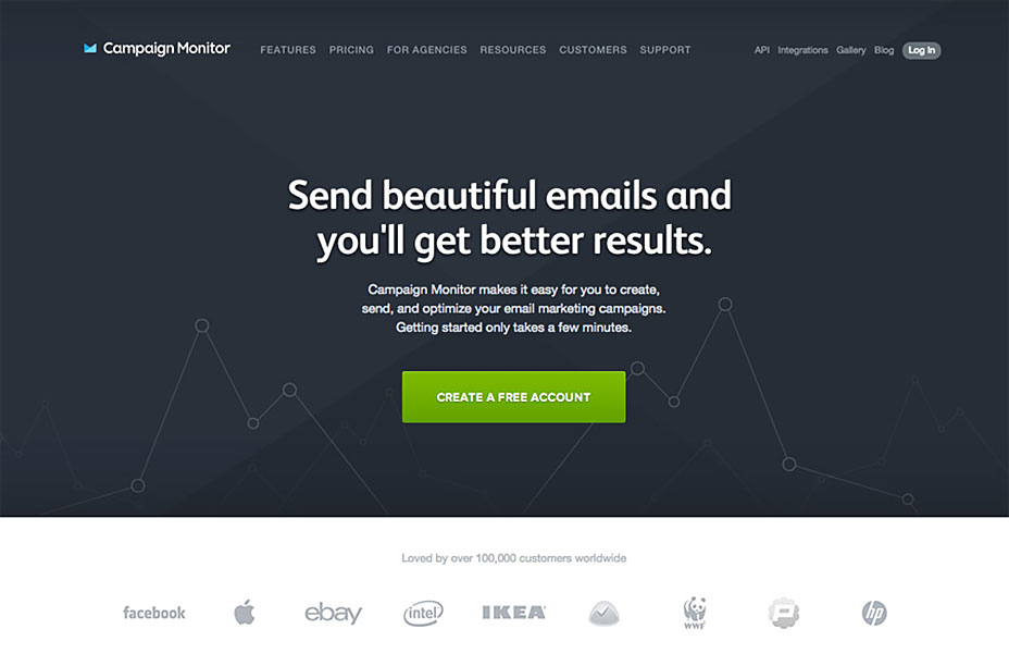
Impeccable grammar, strong words and clarity are key factors for creating a powerful headline copy. An effective message is one that makes your visitors associate with it and take action. Here is how Campaign Monitor formulated their headline – descriptive, appealing and prompting action.
Quick BouTIP
Coordinate your headline with your ad message. When your visitors click on your ad, they should immediately feel the relation between your ad copy and your landing page headline. Otherwise, don’t act surprised by an extremely high bounce rate.
Narrow focus
When designing your landing page, have in mind that your one and only goal is to make your audience convert, i.e. click your valuable CTA button. Eliminate any unnecessary links and details which could distract your viewers and make them navigate away from your landing page. All design elements should serve the purpose of converting and lead your viewers toward the CTA section.
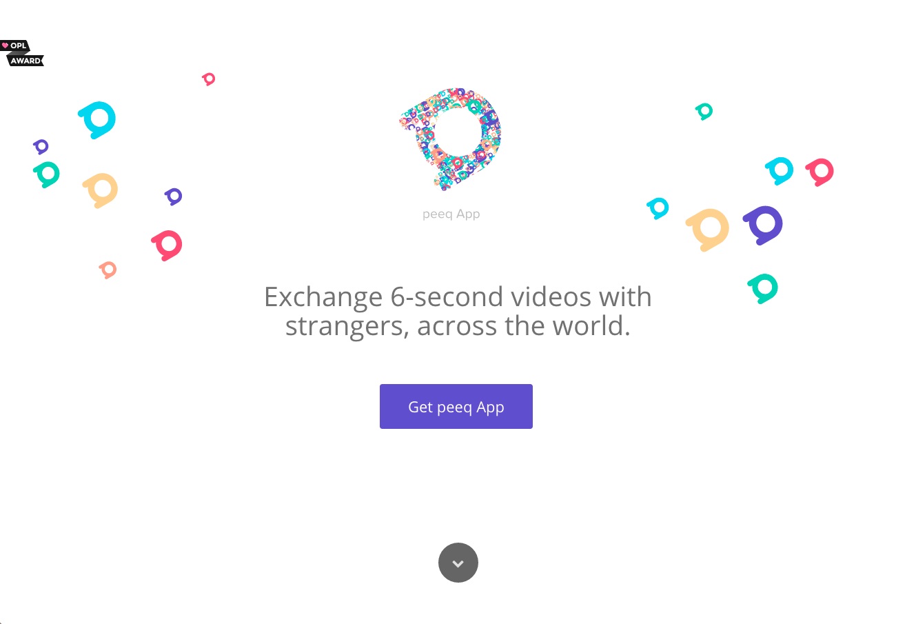
Check out how simple and focused Peeq designed their landing page.
Quick BouTIP
Start by defining your USP (Unique Selling Point) – that one special feature which differentiates your product or service from your competitors’. Then leave only those design elements which promote your primary goal and lead to your main CTA button.
Descriptive and clear copy
The copy in your landing page should be as clear and descriptive as possible. Your audience should be able to immediately understand what your product or service is all about. If they don’t, they would most likely bounce back. Perfect grammar is even out of the question. No one would take you seriously if your copy is full of errors.
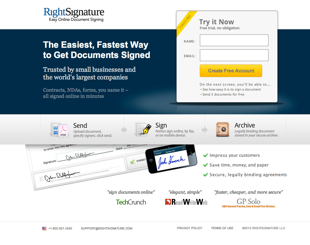
Focus on the benefits and values your product has to offer. Check out how RightSignature formulated their landing page message. It is clear, descriptive and you instantly understand what happens next when you click the CTA button.
Quick BouTIP
It would be a great idea to break up your text with bullets or headlines. Your audience would find it easier to scan and better accept your information.
Incentives
An essential element of every landing page is to contain at least one incentive. As humans, we tend to procrastinate any action we don’t consider urgent. The incentive job is to convey sense of urgency, scarcity or other feelings that prompt action right now and for less consideration.
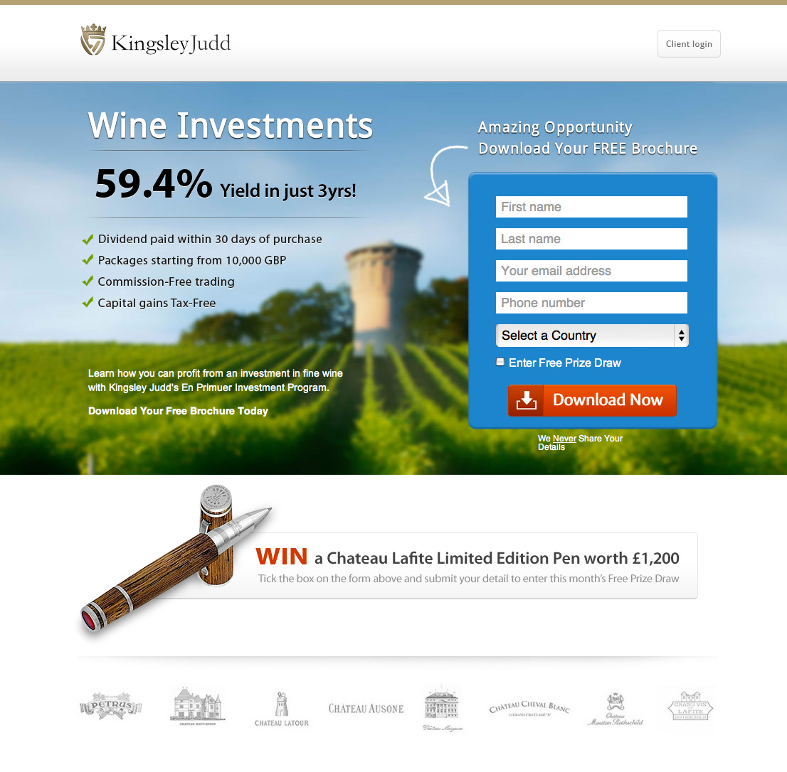
Most landing pages contain implied urgency. This means they use words such as “Now”,“Today”, “Free”, “Limited”, etc. such as the example by Kingsley Judd, given below. In their landing page design they used several incentives to prompt conversions:
- “Download Your Free Brochure Today” in the copy,
- “Amazing Opportunity. Download Your FREE Brochure” above the submission form,
- “Download Now” as a CTA copy,
- “Enter Free Prize Draw” as a the key incentive.
Quick BouTIP
In order to imply real urgency, include real numbers or even countdown timer to depict how much is left until your offer expires. Such examples are:
• “The offer expires at 12:00 UTC ”
• “Hurry! Only 1 spot left.”
• “Only 5 days left until the offer expires.”
Number of fields
How many fields should our submission form contain? The rule is simple. The more fields you include, the higher the risk that your visitors will abandon your submission form. Don’t ask your leads for any unnecessary information. This could annoy them and make them bounce back.
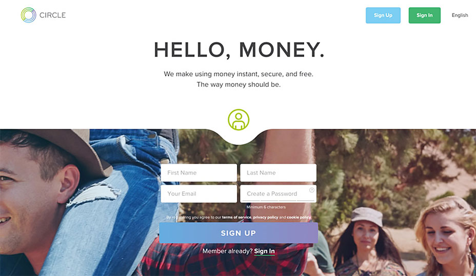
Check out Circle’s signup form. They asked their visitors to enter only the minimum of information needed to create an account.
Quick BouTIP
Usually, including a name and an email address fields is quite a good start for your submission form. Think about what else is essential for your particular landing page purpose. If you find this enough, don’t ask for anything else. All additional information could be collected later.
Guide your visitors
Add directional cues to visually lead your audience towards your call-to-action section. When people land on your page, they should almost instinctively know what to do next. The structure, color, hierarchy and all elements of your page should be directing them towards the valuable CTA button.
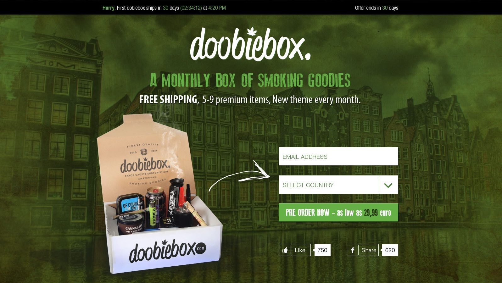
See how doobiebox applied this rule. They used an arrow as a key directional element, pointing at their short submission form. Also, they structured their landing page in such a way to make their form stand out.
Quick BouTIP
If you use images of people in your landing page design, pick carefully. You will have better results if you decide on images of people, gazing towards the CTA section. Your visitor’s eyes will be instinctively drawn at the same direction.
Powerful CTA button
The most important element of your landing page is the call-to-action button. Your whole design should be devoted to this single precious element, so make sure everything leads your visitor towards it. Here is what you should know:
- Placement – undoubtedly above the fold. No one would go searching for your CTA section in order to convert. If you have a long landing page, unobtrusively repeat your valuable button at the bottom.
- Design – make it pop. This should be certainly the most eye-grabbing element of your landing page, so make it large and contrasting. Also, surrounding it with enough whitespace would make it stand out better.
- Copy – clear and descriptive. Your visitors should immediately know what happens next when they click the button.
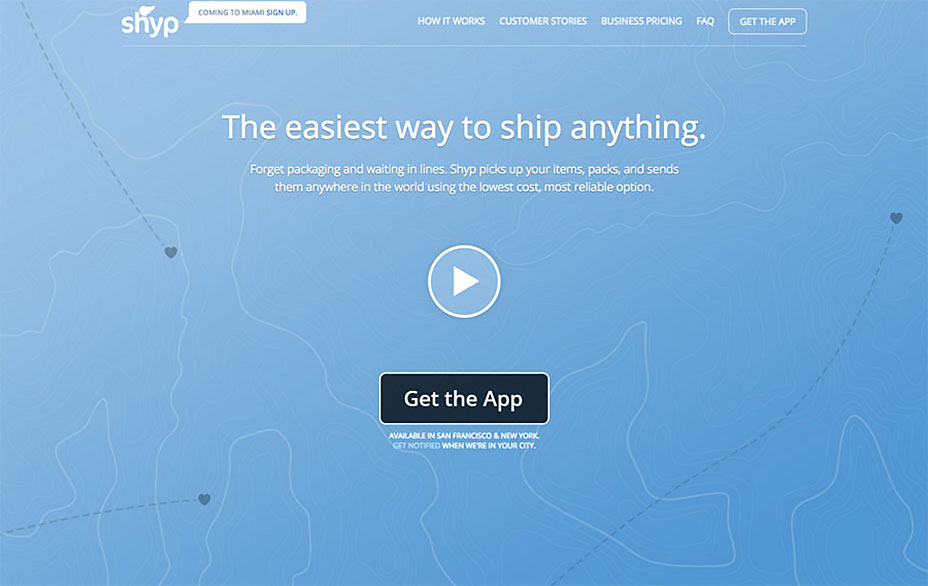
See how Shyp designed their call-to-action button. It is absolutely the most notable element of their design. It is descriptive, contrasting and generously surrounded with whitespace. Indeed, their landing page contains other links, but they are significantly de-emphasized and don’t steal the attention from the CTA.
Quick BouTIP
To make your CTA copy effective, use a simple technique. Formulate the message by starting with “I want to…”, e.g:
• “I want to… Get the App”,
• “I want to… Download the eBook”,
• “I want to… Order Now”.
This way your visitors know exactly what happens when they click the button.
A/B testing
Even if you design your whole landing page by the book, you should constantly test it for improvements. We are all humans and react differently, sometimes even unpredictably. So, it is nearly impossible to design the highest converting landing page for your specific objective from the first attempt.
The right approach is to continuously conduct A/B testing. Test one element at a time for at least a week in order to receive truthful results. You could try changing the elements’ color, copy, size, position, etc.
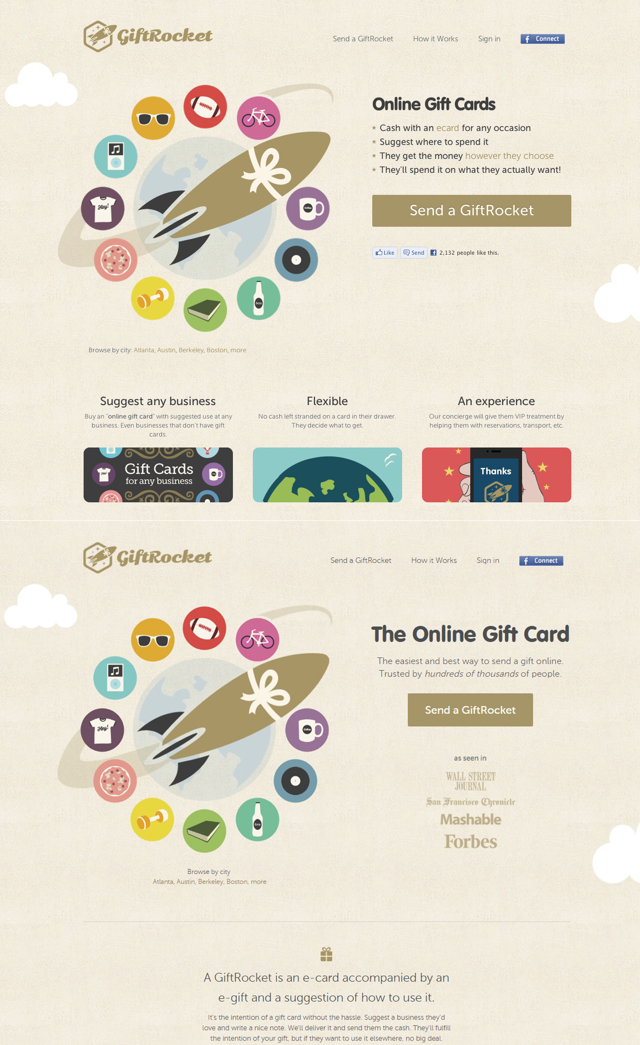
See how Gift Rocket’s landing page changed over time:
- the headline became bigger,
- the copy was entirely replaced by a subheadline,
- the CTA button was shrinked,
- a few social proofs emerged.
Quick BouTIP
The most significant indicator of your landing page is the conversion rate. It shows how well your landing page performs. So, follow this metric day-to-day to get the best idea of how your design alterations affect the way your visitors behave.
Give social proof
Along with everything else, your landing page design should convey trust to your audience. The social proof factor is a powerful tool to prompt your visitors to convert. It brings them confidence, trust and minimizes their doubts. So, what can you use for social proof?
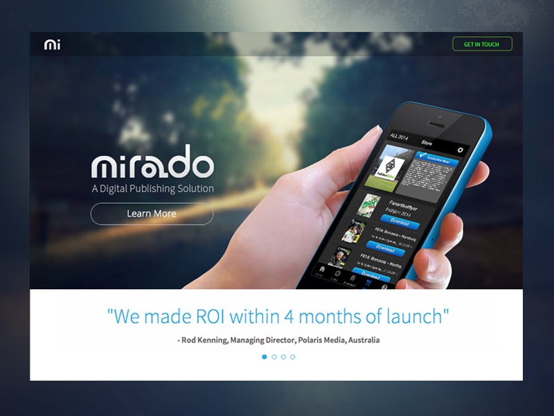
- Testimonials – this is a great tool to convey trust. Needless to say, you should always use real customer reviews and thoughts. Here’s an example by Mirado on the left.
- Security symbols and certifications – use symbols which are very important and specific to your product.
- Logos of widely famous companies who use the product – powerful way to establish trust and motivate action. When your visitors recognize even one familiar brand, they instantly become more willing to accept your message and convert. Here is how Recurly took advantage of this insight.
Quick BouTIP
Test how your audience will react to video testimonials as alternative to quotations. Sometimes, a video could be better accepted because it has the power to convey the real feelings and emotions of the people speaking.
Encapsulation
This is a technique, widely used in landing page designs to emphasize on certain elements, usually the submission form along with the call-to-action button. Why this works? Because this technique creates a visual window which captures the visitor’s eyes and makes them focus. You may have remembered seeing encapsulation in some of the examples listed. Here is another one. Lyft used this technique to wrap up their submission form along with the CTA button.

Quick BouTIP
Encapsulation helps you keep your visitors focused for longer. This is especially useful if your submission form contains more fields than usual. Encapsulate it to increase the chances for your leads to fill out the entire form.
Turned out, LANDING PAGE actually is an abbreviation! Eleven valuable tips hidden within its name itself. No matter if you are planning to redesign an existing landing page, or start a brand new one from scratch, all of them would certainly come in handy and effective to help you get the best out of your design!